The daily growth of OSM nodes
In my first blog post, I presented how to create a choropleth map of OpenStreetMap
contributions; by using the web scraping technique, I was able to count up to 75 % of
all the existing nodes, a good initial estimate. Even so, just summing the nodes in each
country is not a complete exploitation of the data; after all, we are talking about 738 thousand
observations. So now we are going to estimate the rate of growth of the contributions in each
country. We will use tidyverse to simultaneously load several packages that we need.
library(sf)
library(tidyverse) # loads dplyr, ggplot2, purrr, tidyr

data("World", package = "tmap")

countries = select(st_drop_geometry(World), country = name, continent) %>%
   left_join(countries) %>% # countries dataset as created in my first post
   filter(date != as.Date("2019-11-01"))
In this first step I discarded the territories that cannot be represented in the map (reducing them from 253 to 173), and I also added the continent to which each one belongs. Before computing the rate of growth, a valid argument is that we have more observations than needed, because of the daily periodicity. One strategy to reduce the amount of observations is to aggregate (group) them into a less frequent periodicity; therefore, in the next step, I compute the sum1 and the cumulative sum of created nodes, by the end of each month.
countries_month = mutate(countries, across(date, lubridate::ceiling_date, "month")) %>%
   group_by(continent, country, date) %>%
   summarise(nodes_sum = sum(created)) %>%
   mutate(nodes_cum = cumsum(nodes_sum), date = date - 1) # last day from each month

head(countries_month)
## # A tibble: 6 x 5
## # Groups: continent, country [1]
## continent country date nodes_sum nodes_cum
## <fct> <chr> <date> <dbl> <dbl>
## 1 Africa Algeria 2011-11-30 45598 45598
## 2 Africa Algeria 2011-12-31 60887 106485
## 3 Africa Algeria 2012-01-31 46259 152744
## 4 Africa Algeria 2012-02-29 33228 185972
## 5 Africa Algeria 2012-03-31 24461 210433
## 6 Africa Algeria 2012-04-30 15374 225807After the aggregation there are 96 monthly observations for each territory. This amount of data is now adequate to fit a model, but it is still too large to plot. For the graphic below I aggregated the data even more: I computed the mean monthly created nodes in each continent2, except Antarctica.
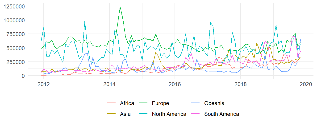
Figure 1: Mean monthly created nodes in each continent
Here we can verify that the greatest levels of contribution occur in european countries. And while in Africa, Asia and South America participation has historically been lesser, it has increased through the years. Now, if we wanted to plot the evolution for every country, that would be an illegible graphic. Instead, let's select, from every continent, the two countries with the most nodes; in decreasing order, these countries are:
- United States 🇺🇸
- Russia 🇷🇺
- Canada 🇨🇦
- France 🇫🇷
- Indonesia 🇮🇩
- Japan 🇯🇵
- Brazil 🇧🇷
- Tanzania 🇹🇿
- Australia 🇦🇺
- Nigeria 🇳🇬
- New Zealand 🇳🇿
- Argentina 🇦🇷
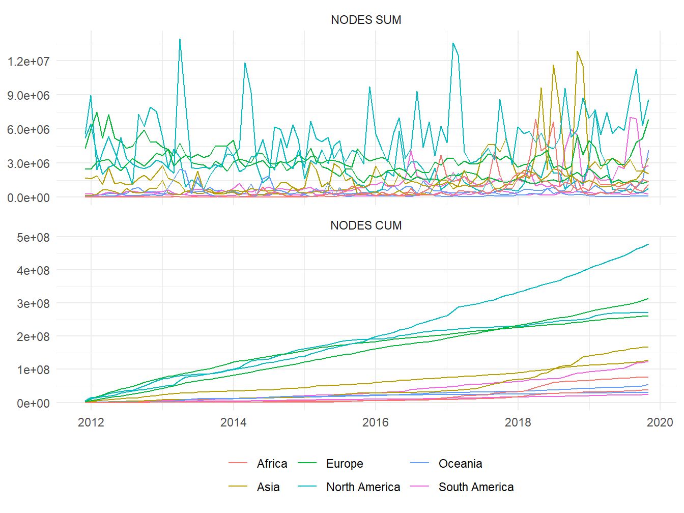
Figure 2: Sum 👆 and cumulative sum 👇 of monthly created nodes in selected countries
As expected, european and north american countries are where created nodes reach the highest values; there were few times when they were surpassed by a country from another continent. If we look to cumulative sums, rather than just monthly sums, we will realize that they seem to have a linear evolution, with United States having the steepest slope, followed by a group comprised of Russia, Canada, France. Arguably in most projects, quantities such as number of members or contributions will always have linear or exponential growth; whether it is the former or the latter, it depends on how the project operates.
Prior research in OpenStreetMap have already revealed a linear behavior. Neis, Zielstra, and Zipf (2013), while comparing the contributions in twelve big cities around the globe, observed a linear increase of contributing members from January 2007 and September 2012; this was discovered when they normalized the number of members with respect to the total population or the area of the city. The cities, in decreasing order of growth of contributors, were:
- Berlin (🇩🇪)
- Paris (🇫🇷)
- Moscow (🇷🇺)
- London (🇬🇧)
- Los Angeles (🇺🇸)
- Sydney (🇦🇺)
- Johannesburg (🇿🇦)
- Buenos Aires (🇦🇷)
- Osaka (🇯🇵)
- Istanbul (🇹🇷)
- Seoul (🇰🇷)
- Cairo (🇪🇬)
Again, the european cities occupy the first places, and then one city from North America. A similiar order appears in the graphic below (Neis, Zielstra, and Zipf 2013), which depicts the number of objects -normalized with respect to the area- that existed in those cities.
Density of OpenStreetMap elements in several cities up to October 2012; by Pascal Neis, Dennis Zielstra, Alexander Zipf
With these antecedents, I decided to fit a linear regression3
for each country; the cumulative sum of nodes will be the output variable, and time will be the
input, along the eight years (from November 1, 2011 to October 31, 2019) worth of observations.
A tidy way to do this task is to tidyr::nest() (encase) the observations by
country, and then execute lm() in each nested group.
countries_model = nest(countries_month) %>%
   mutate(model = map(data, ~lm(nodes_cum ~ date, data = .)),
          model = map(model, ~c(coef(.), summary(.)$r.squared)),
          name = list(c("intercept", "rate", "rsquared"))) %>%
   unnest(cols = c(model, name)) %>%
   pivot_wider(values_from = model)

head(countries_model)
## # A tibble: 6 x 6
## # Groups: continent, country [6]
## continent country data intercept rate rsquared
## <fct> <chr> <list> <dbl> <dbl> <dbl>
## 1 Africa Algeria <tibble [96 x 3]> -65540524. 4211. 0.982
## 2 Africa Angola <tibble [96 x 3]> -38861484. 2443. 0.740
## 3 Africa Benin <tibble [96 x 3]> -28410417. 1791. 0.909
## 4 Africa Botswana <tibble [96 x 3]> -56111053. 3536. 0.898
## 5 Africa Burkina Faso <tibble [96 x 3]> -46220666. 2921. 0.927
## 6 Africa Burundi <tibble [96 x 3]> -13142257. 843. 0.857To illustrate the results, here are the regressions for the previously selected countries:
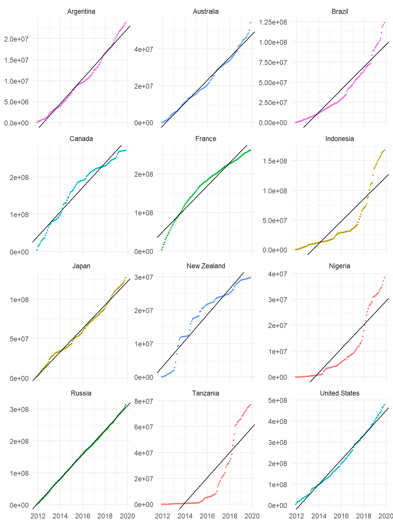
Figure 3: Fitted linear regressions in selected countries
In most cases a fair fit was achieved, according to the determination coefficient R2; the mean of this coefficient across the 173 territories was 0.8957. Only in nine countries (their regressions are plotted below) the R2 coefficient was less than 0.70; probably those countries were recently recognized in our data source, or received contributions in a sudden manner.
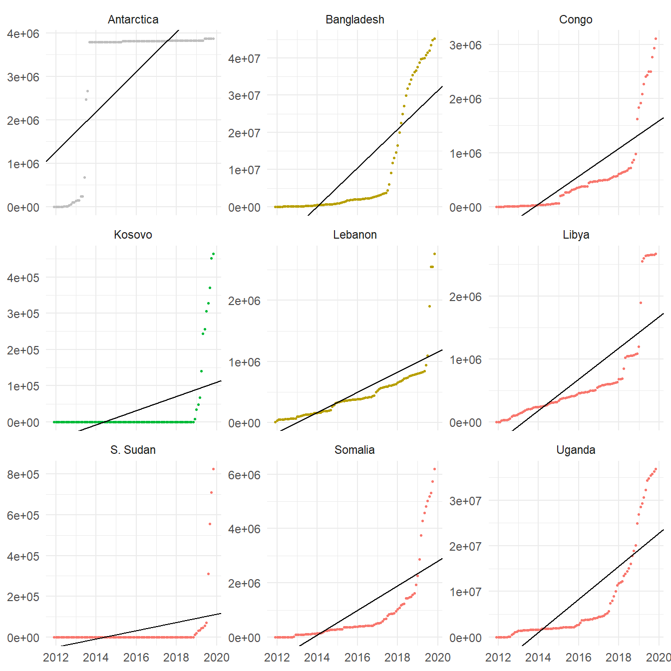
Figure 4: Fitted linear regressions with R2 coefficient less than 0.70
For those territories that had a good fit, the regression's slope will be the estimated parameter that characterizes the growth of contributions; this value represents the daily4 rate of nodes creation. The intercept, on the other hand, is not relevant in this analysis. The mean slope was 9275 and the maximum was 159555 daily nodes; the latter corresponds to the United States and is an outlier.
How can we measure the accuracy of these estimates? Neis and Zipf (2012) reported that, in January 2012, the global rate of contributions was about 1.2 million nodes, 130 thousand ways and 1500 relations created every day. If we add all the slopes that we estimated, a global rate of 1.605 million daily nodes is obtained; this is greater than the rate reported in 2012, which makes sense since now there are more contributors.
To finish this post I present the choropleth maps of slopes (which we already know represent the rates of growth of nodes) and R2 coefficients, of the fitted regressions for each country.

Figure 5: Estimated daily rate of OpenStreetMap nodes creation by country

Figure 6: R2 coefficient of the fitted linear regressions by country
Neis, Pascal, Dennis Zielstra, and Alexander Zipf. 2013. “Comparison of Volunteered Geographic Information Data Contributions and Community Development for Selected World Regions.” Future Internet 5 (June): 282–300. https://doi.org/10.3390/fi5020282.
Neis, Pascal, and Alexander Zipf. 2012. “Analyzing the Contributor Activity of a Volunteered Geographic Information Project — the Case of Openstreetmap.” ISPRS International Journal of Geo-Information 1 (December): 146–65. https://doi.org/10.3390/ijgi1020146.
I simply computed the sum of created nodes, without subtracting the deleted ones. As a consequence, the rates of growth I present by the end of this post cannot be used to compute the final amount of nodes in any country.↩︎
Bear in mind that the number of countries amptly varies among continents, from 7 in Oceania, to 50 in Africa.↩︎
Since the initial amount of nodes is zero, it makes sense to compute a regression through the origin (one where the intercept is fixed at zero). That option was assessed too, but it did not produce better fits, compared to the typical linear regression. Seems like this is one of those cases where the simpler model is adequate.↩︎
It is true that the data became monthly but, due to the way R handles dates, the rate will indicate the change in nodes when the date increases by one day.↩︎